1. OATLY

OATLY’s packaging has a very simple color palette, and uses more unique font choices. The simplicity of their packaging gives it a more modern feel, which I think suits their target audience. Described as “bold, playful, and minimalistic,” their branding style aligns with the preferences of younger demographics, who often gravitate towards minimalistic and clean designs. OATLY’s uncommon font selections further enhance their visibility in the market. As one of the first oat milk brands to hit store shelves, OATLY’s packaging immediately captured attention. This was particularly notable given the dominance of almond, soy, and coconut milk alternatives at the time. I rate their packaging a 9 out of 10 because of the clean and unique design. The all-blue carton stands out, and makes me gravitate towards it compared to others (and I’d buy it if it weren’t the most expensive brand on this list).
2. Planet Oat

The packaging for Planet Oat adopts a distinct aesthetic, leaning towards a more natural vibe. There’s a lot happening visually, with elements like the oat ring and oats splashing into milk, creating movement. It’s also very “OAT MILK-y” if that makes any sense. Anyone looking at the packaging would know it’s oat milk right away. On the sides and front of the carton, it talks about it’s benefits and what you can use oat milk for. “No sugar added” and “Free from ____” being on the carton make it a little more persuasive. People might gravitate towards this brand because of it’s health claims on the front. I rate their packaging an 8 out of 10. I like the font choices and the “OAT-y” theme.
3. Chobani

Chobani has been my favorite oat milk brand for 2+ years, so I see this carton nearly every day. I like the scenery pictured on the bottom of the carton; The little farmer pouring the milk into a giant glass is fun to look at. What’s nice about the carton is how it has a dedicated space for health claims, rather than putting them as floating text across the design. Chobani has a lot of oat milk varieties, as well as the other brands listed, but Chobani’s design differences for each variety stand out to me. The vanilla oat milk has a blue theme instead of yellow, sugar free’s theme is green, and extra creamy has a red theme. All cartons have the giant glass in the middle, but the little farmer is doing something different for each variety, which I think is cute and unique. I rate Chobani’s packaging a 9 out of 10. Personally, I like OATLY’s funky design a little bit better, but I like the uniqueness of Chobani’s design. The little farmer also gained a point for doing a different task on each carton.
4. Friendly Farms (ALDI’s brand)
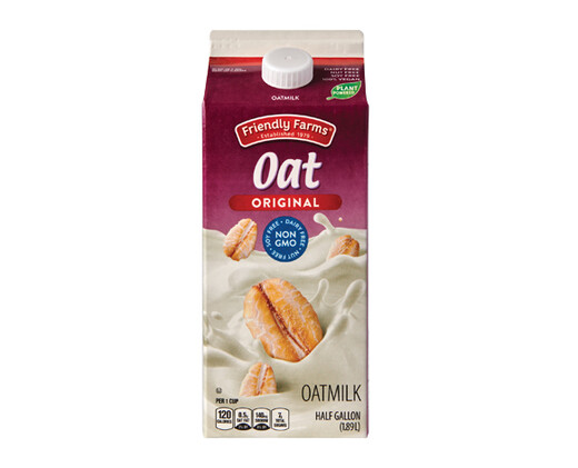
I find the packaging a little ugly, not necessarily because it’s a “knockoff,” but because it doesn’t match my aesthetic preferences. It provides all the necessary information on the carton, and the imagery of oats floating in a pool of milk adds some visual interest. One aspect that bothers me is the floating “Oat” text. It seems a bit disjointed since it doesn’t explicitly say “Oat milk.” It says it on the bottom, but I feel like it should be on the top. Aldi brands typically base their packaging off of the brands they’re competing against. In this case, Aldi’s oat milk loosely replicates Silk’s packaging. Both cartons are purple and use a similar display font. Silk’s packaging uses more solid colors, while Aldi’s uses gradients. For me, too much gradient doesn’t look good. The background and the Friendly Farms logo have gradients. I rate ALDI’s packaging a 6 out of 10. I’m not the biggest fan of how it looks, but it has all of the necessary content on the carton. Even if it looks ugly to me, someone else might think it looks good.
Brief disclaimer: Me rating the packaging was just for fun, and I mean no harm. I have never been influenced by the packaging alone on any of these brands. I picked them because of price or availability. I am not a professional, and I don’t have a critic’s keen senses. It’s just how my “design eye” saw it.